John Smith
You have 4 new messages


Ever heard of Mobile-First Index? It is the name of the new mobile- based indexing process adopted by Google on 1st July 2019 for positioning in search results.
If you are at all familiar with some of Google’s guides for users, you may have noticed that the Mountain View Team has been urging web owners to pay particular attention to optimizing their websites for mobile devices.
[divilifeshortcode id=’9530′]
Since it’s pretty much clear that mobile-friendly websites rank better on SERPs, it is also clear that Google’ prefers mobile-optimized websites. This has been evident for a while now, but since March 2021, it has become more important than ever before.

Google states it in its Guides:
“Mobile-first indexing means Google predominantly uses the mobile version of the content for indexing and ranking.”
And the reason is explained in the next point:
“Searches from mobile devices are more than half of all the searches made on Google.com.”
Simply put, Google is telling us that since session from mobile devices are far greater in number than session from pc, ranking priority will benefit who can provide mobile-friendly content.
Let’s try to better understand how SERPs are changing, what steps site owners must take to adapt to this real and true «revolution”, and how to best optimize sites for mobile devices.
Initially, when the Mobile First Indexing roll-out was set up a few years back, it simply favoured mobile-friendly sites for compiling index results. However, starting March 2021, the Google home algorithm will only consider the mobile version of a site in its ranking process. This apparently subtle paradigm shift can have a huge negative impact on your site SERP. In fact, this so-called “revolutionary” decision comes as no surprise to the industry due to this significant growing trend for mobile in recent years: most web traffic comes from mobile devices.
In 2016, the percentage of internet traffic from smartphones and tablets exceeded desktop traffic for the first time at 51.3% v 48.7%.
Although this trend was initially driven by emerging markets, namely India, 75% of online traffic came from mobile devices. This growing trend was already unmistakably detected: the rate of change varied from country to country, but crucially, desktop traffic was destined to be overtaken by its mobile counterpart.

The decision taken by the Mountain View giant was thus expected: up until not so long ago, Google spider indexed the desktop version of sites for determining google search rankings but, from this point onwards, it will be now essential to primarily optimize the mobile version, the new favourite. For some years now, Google has clearly turned its attention to increasingly prioritizing mobile over desktop.
The decision to officially roll out the new policy starting March 2021, was only a formality that had been in the pipeline for a while. Google Mobile-First Indexing «obliges» web owners to develop optimized and responsive sites for mobile viewing. Otherwise, their sites risk being excluded from the SERP.
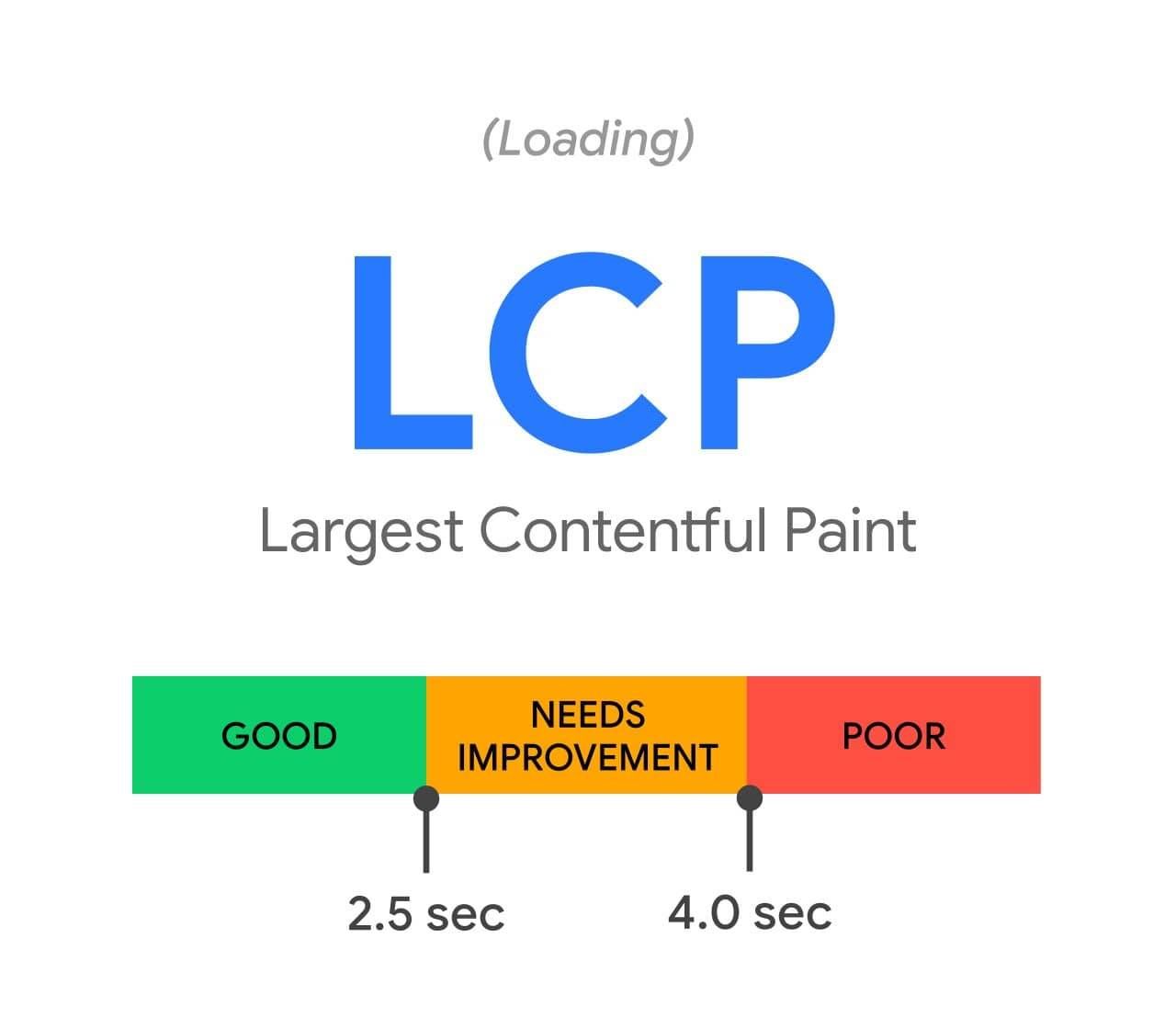
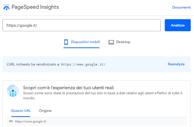
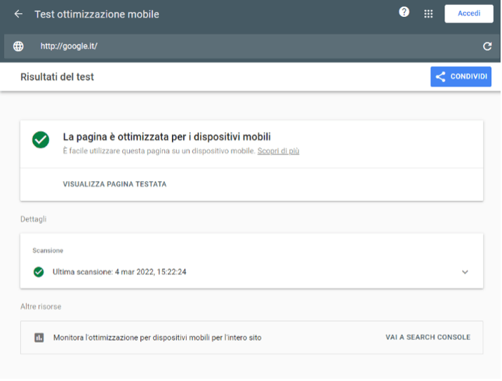
It is no coincidence that Google’s own tool for measuring site performance, PageSpeed Insights, measures firstly the performance of a site for mobile devices and secondly for desktops.
Have you ever had to browse a site from your mobile phone, rotate the screen, scroll horizontally, enlarge the text, or click several times on a button that just doesn’t want to work? Yes, you certainly have come across an unresponsive site! Then what happened? You probably abandoned the site a few seconds later and searched for a more readable and easier- to- navigate one.
Alarm bells have been ringing amongst webmasters for some time now. They have realized that sites which do not take the user experience through mobile devices into account have a lot to lose in terms of sessions and thus, in potential conversions. An effective marketing strategy cannot afford to ignore the evidence staring it in the face.

According to statements issued by the same Google, users are five times more likely to abandon non-optimized sites for mobile devices than mobile-friendly ones. The user browsing experience is the overriding factor to be taken into consideration when evaluating possible modifications for viewing and functionality on your site.

The advantages of adopting a responsive design cannot be denied. Its flexible structure, which can automatically adapt to the characteristics of the device being used to navigate a site, means that a website owner is not obliged to create a separate website, and therefore code, for desktop and mobile versions. Many website owners have known for a long time now that the equation for this new Google indexing era is: user-friendly equals mobile-friendly.
How can we work on our site to optimize it for mobile devices? Let’s find out in the next paragraph.
If you are a site owner and are unsure how to manage the first delicate stage, the first thing to do is carry out a detailed analysis to assess the level of mobile optimization of your website. Google offers a few useful tools for this task.
Once the mobile-wise health state of your website is clear, the next step is compiling a list of clear objectives, define an overview of the problem and then review the development of your website for faultless mobile navigation. If you want to start off on the right foot, you need to have a mobile-oriented approach. What does that mean? Remember, contrary to your previous approach, you will now need to think in reverse order. This means starting with restructuring the mobile version and then only subsequently adapting it to the desktop version by reviewing font type and size, images, videos, colors, and all site elements.
So let’s take a look at some of the ways you can optimize your blog or e-commerce site for search engines moving towards mobile- friendly indexing. The fundamental concepts to remember in this process are:

3. Make it happen. If your goal is to increase conversions, you must not overlook the optimization of CTAs, buttons, internal links and all the other functions that could turn your mobile user into a customer. Make sure they are always fully visible and easy to use on both desktop and smaller screens.
4. Get in touch. Have you ever wanted to fill out a contact form on your smartphone but quickly quit because you either had to continually zoom the page or discovered the final button was not responsive? If the subject was of particular interest to you, you may have made a mental note to yourself to follow it up on your home PC, but you most likely forgot about it an hour later. Don’t allow this to happen to your site visitors either – make sure you optimize interactions for mobile users and minimize the necessary steps required to fill out a contact form or make a purchase.

5. Speed it up.About 50% of mobile users abandon a website if loading is not completed within three seconds. Three seconds: this very short time span is decisive for users who seek clear, reliable information- and quickly. If page loading speed was already crucial to increasing desktop visits, it is essential for mobile sessions. Visiting a website via smartphone is generally a quick-based activity and takes places outside the home or while engaged in another task, so being able to response quickly is more important than ever under these conditions.
Recent studies have shown that just a single split- second delay in loading a site can lose a business 15% of conversions. Users know if your site doesn’t have good usability or doesn’t perform quickly, some other site on SERP will tick these boxes. If data analyses from Analytics detect a growth in bounce rates from mobile and a decrease in conversion rates, the time to take the next step towards your user has come: a fast and intuitive mobile-oriented website will be the real catalyst to kick-start your conversions, helping you to build a successful business.

iSmartFrame is the solution to maximizing speed and conversion performances on websites and in e-commerce, also, but above all, from mobile.